SchedAero Trip Details Page
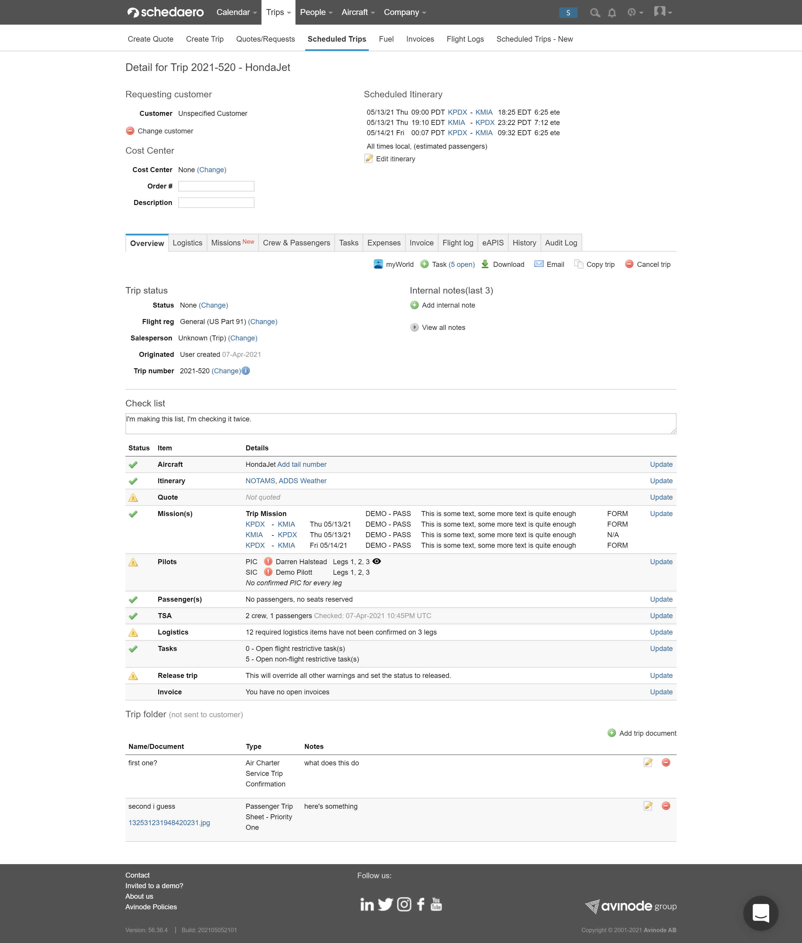
SchedAero creates software to support flight operations for private jet operators and jet manufacturers. Every flight in SchedAero consists of a trip. The trip details page is one of the most important pages in SchedAero, and one of the oldest. Over the years the complexity of the page and the types of operations SchedAero supports has increased, and with each addition came a new page section or new tab.
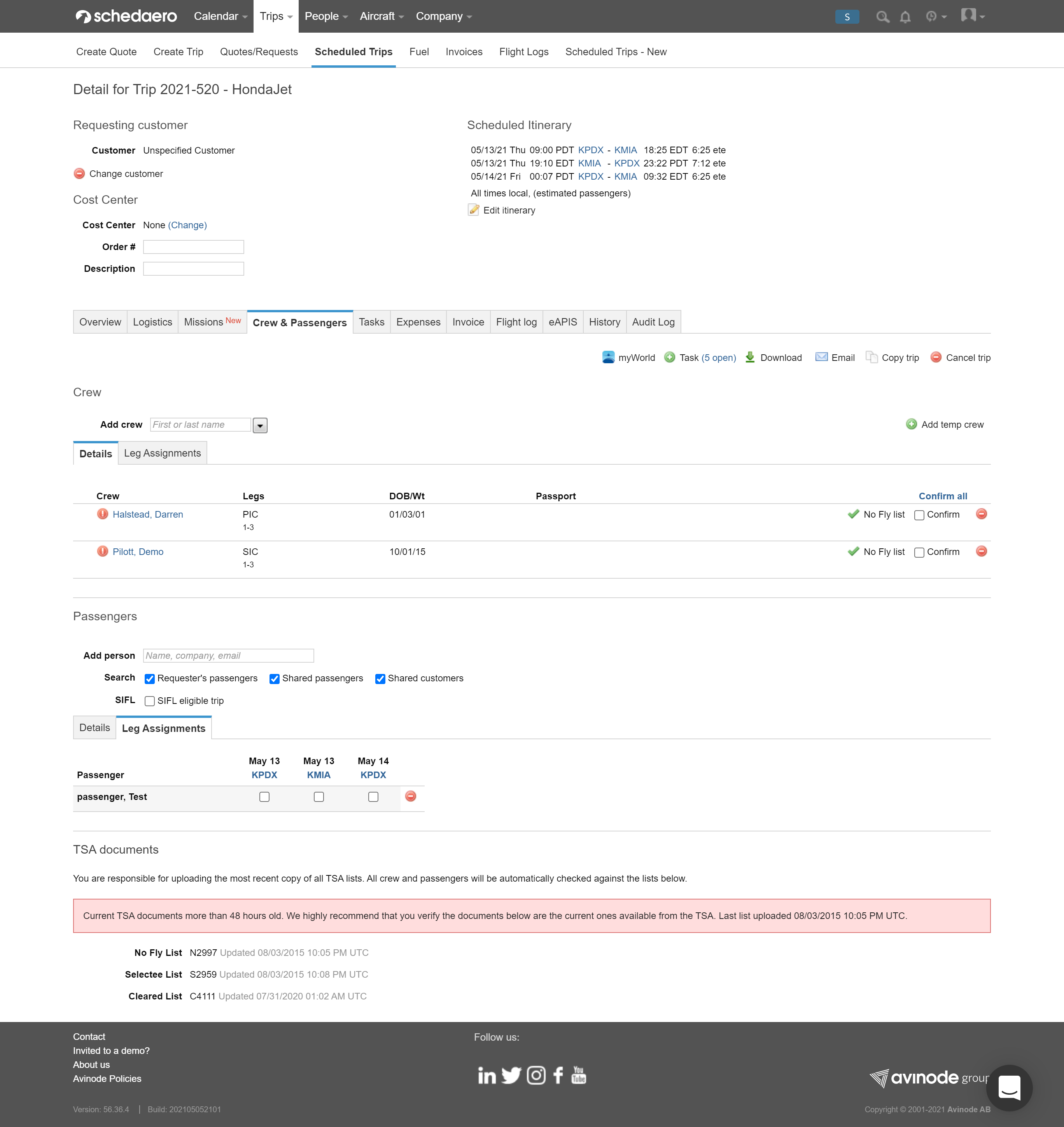
The current trips page has 11 tabs, some of which have duplicate information from the “overview” tab. I spoke with several customers about how they use this page, and what I got back was that it was cumbersome and only a few features were used frequently.
I interviewed several people in the process of preparing for the redesign, most of whom are current or former dispatchers at operators we do business with. Some of the people I interviewed had also used one or two of SchedAero’s competitors’ software. The conversations all had common themes; the current page was cumbersome, and the way the software handles tasks and notes leaves little room for communication across departments and accountability. For example, at many operators a pilot may never see the trip page the dispatcher uses (the pilots largely rely on the SchedAero Pilot app for this). A dispatcher could leave a note or task intended for a pilot, and the pilot might not ever know it was there.
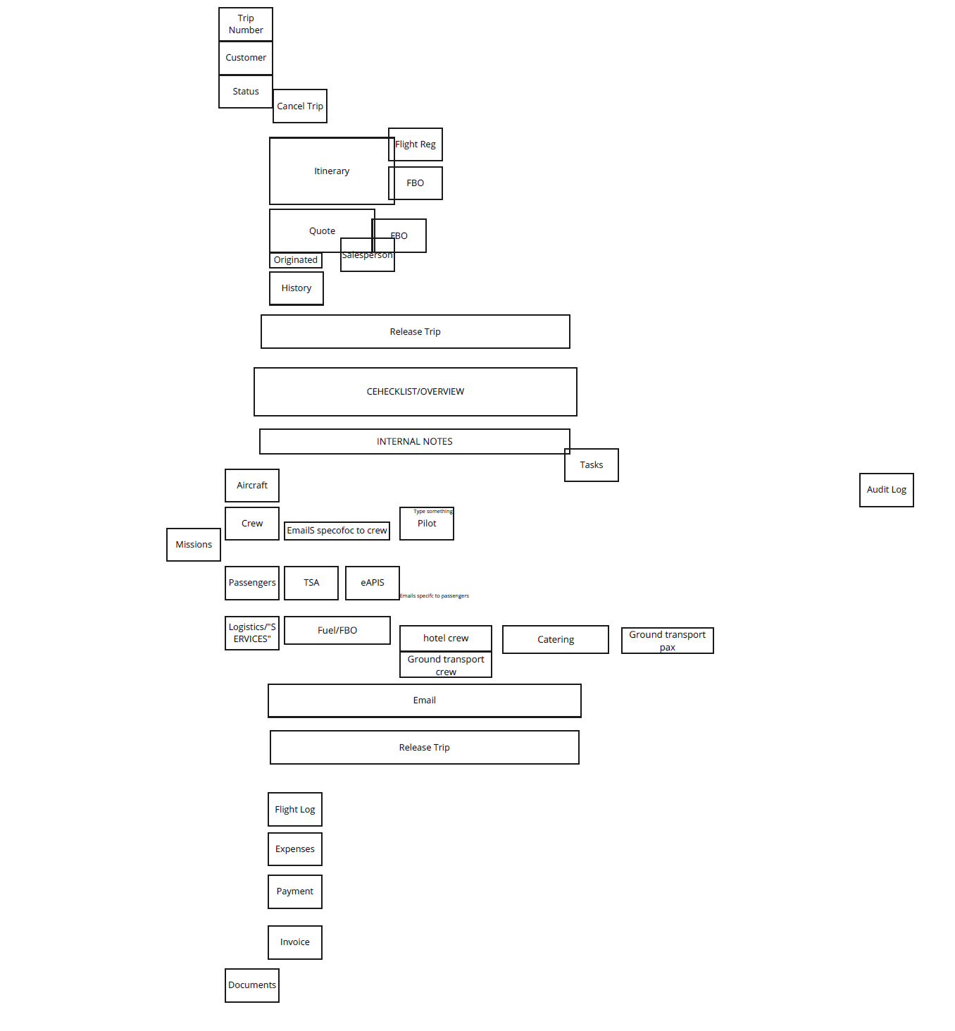
One of the exercises I did with the operators I spoke to was a card sort. I took a note of every feature on the trips page, and using a remote collaboration tool (Miro) I was able to ask them to perform a rudimentary card sort. This was during the height of the COVID-19 “third wave,” and before vaccinations had become available to most people, and also allowed me to work with people in offices all around the country.
I had seven participants in the card sort. Their sorts were all very different, but many of them had the same stated ideas: different flows for different jobs, an easier way to find the information they needed, and more collaboration between employees.
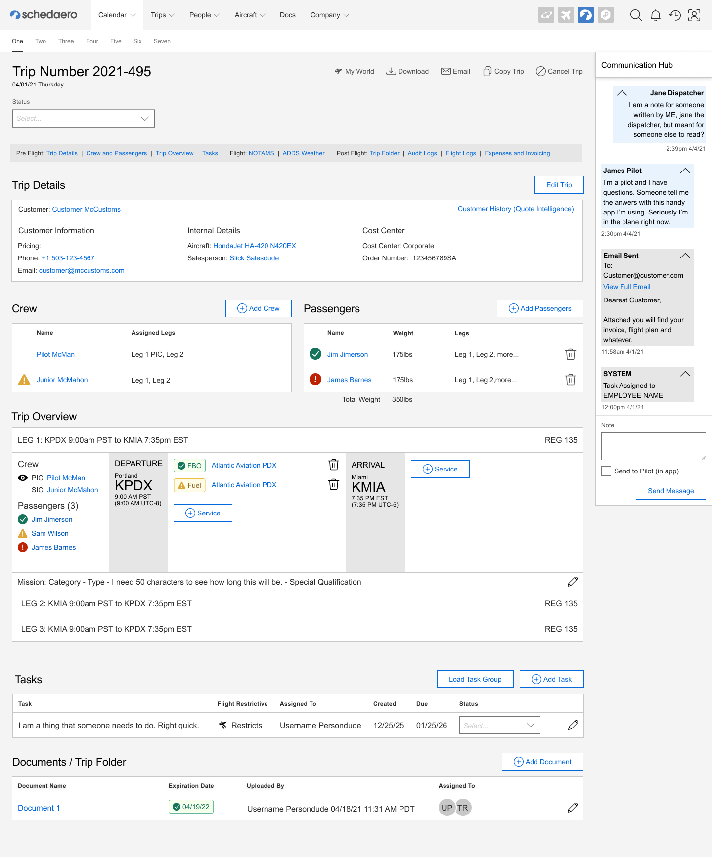
I gave some thought to what I had heard from the users and began to design something wholly different from the existing page, and wholly different from the existing web application (as the issues represented on the trips page are a microcosm of the whole system). I removed all of the tabs and favored a screen that gave users everything they needed to know at a quick glance, without duplication. Quick nav anchors at the top (which stick to the top when the user scrolls) allow for ease of access to the entire trip, things that were done by people other than dispatchers or people immediately working to get a flight in the air, such as expenses or invoicing, were shunted to a new page away from flight operations. A new “communications hub” was added, which allows for all communications about a trip to be focused in one spot. It also allows for messages to be sent to the pilots via the iOS Pilot app, where the pilot is most likely to see them. Messages can also be sent by the system to notify a user when they’ve been assigned a task, especially if that task is flight restrictive. We will have to create a new notifications function in the web app to support this.
I have given several dispatchers a demo of the new trip details page, and the feedback has been overwhelmingly positive. There is still much work to do, but this is a solid first step in a very long process. A lot will have to change in the SchedAero framework to support this. The first thing we are building is the messaging and notifications systems, then we’ll work into the rest of the new support structures that will allow us to build this page.
Figma Prototype
This Figma prototype works best at full screen resolution.
Upon building this page I noticed several accessibility errors appear in my testing. These errors originate from the Figma iframe. Unfortunately, I do not have any control over it. If you are using assitive technologies you have my deepest apologies.